Helpful ggplot2 code snippets for personal use
In this blog… or more appropriately personal bank of code snippets, I
document a bunch of helpful ggplot2 code that I have used
throughout my life as an aspiring statistician.
Bar Chart
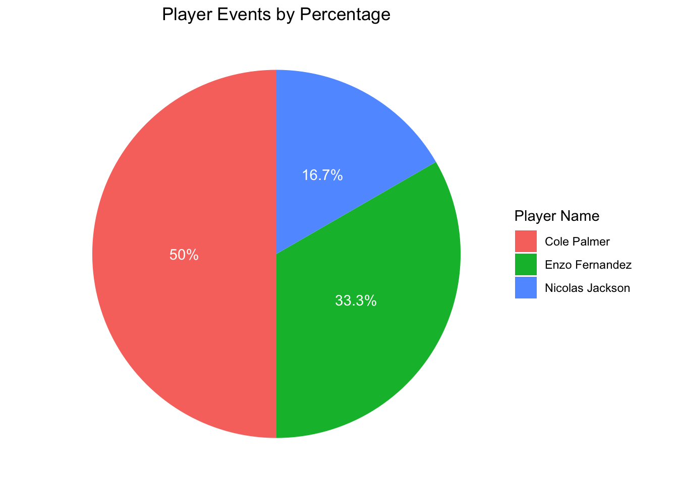
print("hello barcharts!")## [1] "hello barcharts!"Pie Chart Code
##   event_id     player_name
## 1       43 Nicolas Jackson
## 2       48 Nicolas Jackson
## 3       14 Nicolas Jackson
## 4       46  Enzo Fernandez
## 5       16  Enzo Fernandez
# First we have to calculate the frequencies of each player in the data
count_data <- event_data |>
dplyr::count(player_name) |> # creates a new variable called 'n'
dplyr::mutate(percent = n / sum(n) * 100.0)
count_data |>
ggplot2::ggplot(aes(x = "", y = n, fill = player_name)) +
ggplot2::geom_bar(width = 1, stat = "identity") + # we use identity because the table has counts
ggplot2::coord_polar("y") + # we need this so we can create the pie chart
ggplot2::theme_void() +
ggplot2::geom_text(aes(label = paste0(round(percent, 1), "%")),
position = position_stack(vjust = 0.5),
color = 'white') +
ggtitle(label = "Player Events by Percentage") +
labs(fill = "Player Name") + # we specify fill because of the aes(fill =) earlier in the snippet
theme(plot.title = element_text(hjust = 0.5)) # center the title